Concept
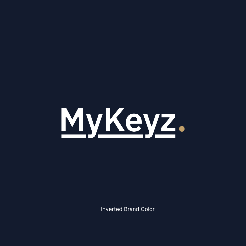
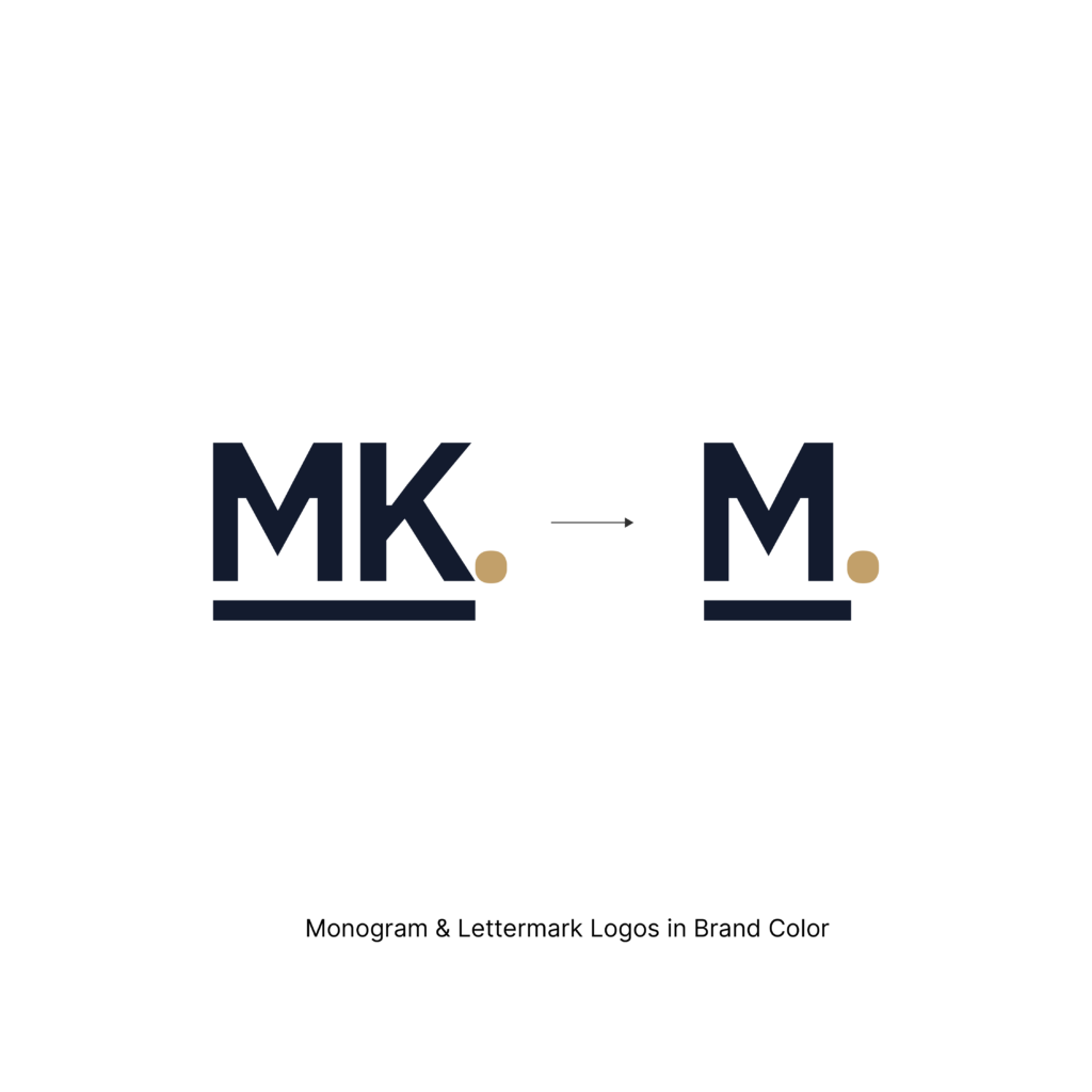
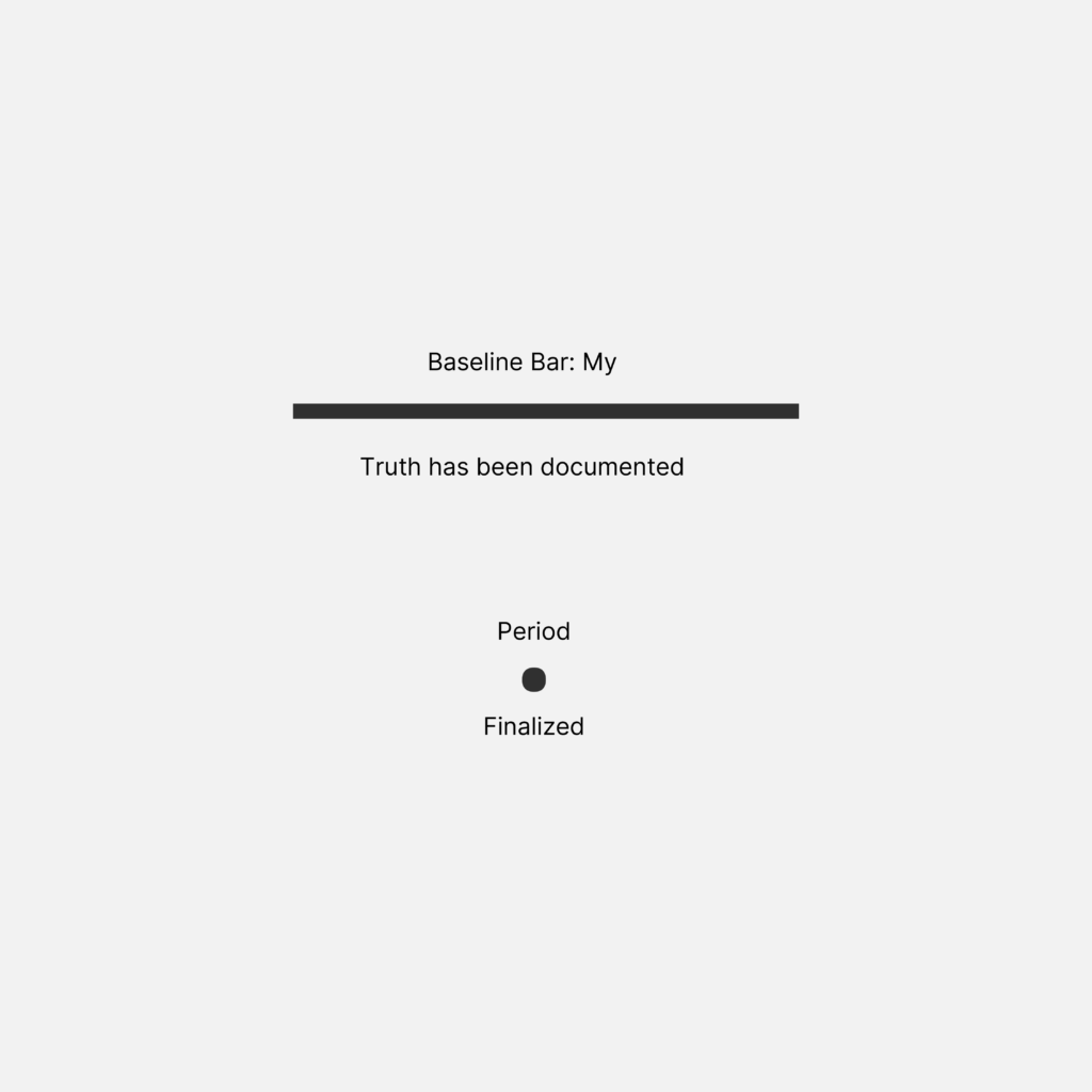
Underlining text is something that is actually more of a human thing. We underline or highlight things when we feel they are important, truthful, or special, or something worth remembering. I wanted to add this human touch to MyKeyz by underlining it and branding it as a baseline bar that symbolises the word ‘My’ and combine this with the already strong and established finalized period concept.
It feels like Carlos wrote it and underlined it himself with a period. This is the kind of confidence that MyKeyz gives for anyone to not only use it but own it as theirs as ‘My’.
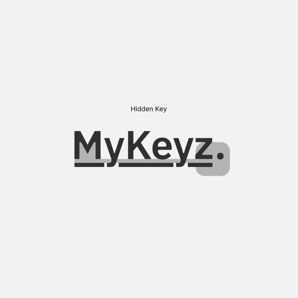
It also happened as I was observing the entire thing closely; I noticed the period looked like the keychain hole at the end of a key, and the entire underlined text has a key hidden within the negative space. This felt good and felt like MyKeyz is quietly working in the background.
This quiet discovery reflects how MyKeyz itself operates: working silently in the background while providing confidence, protection, and proof when it matters most. Paired with Eclipse Blue and Quiet Gold, the identity feels calm, trustworthy, and enduring. Eclipse Blue provides depth, confidence, and authority without feeling corporate, while Quiet Gold serves as a subtle signal of verification, completion, and trusted documentation. Together, these elements create a brand that feels personal yet professional—giving Carlos the confidence not only to use MyKeyz, but to feel that the record truly belongs to him.
This final concept uses IBM Plex Sans, a typeface chosen for its balance of clarity, trust, and human character. While highly functional and precise, IBM Plex feels less neutral than many modern sans-serifs, giving it a subtle sense of personality that aligns with MyKeyz’s role as a trusted companion rather than a cold technical tool. For Carlos, this matters because he is not looking for advanced technology—he is looking for something he can trust.
The underlined logotype is also something that is completely rare and unique in the world of logos. It instantly catches quiet attention, and how the y’s of the IBM Plex typeface naturally align with the underlined baseline bar was a happy coincidence.


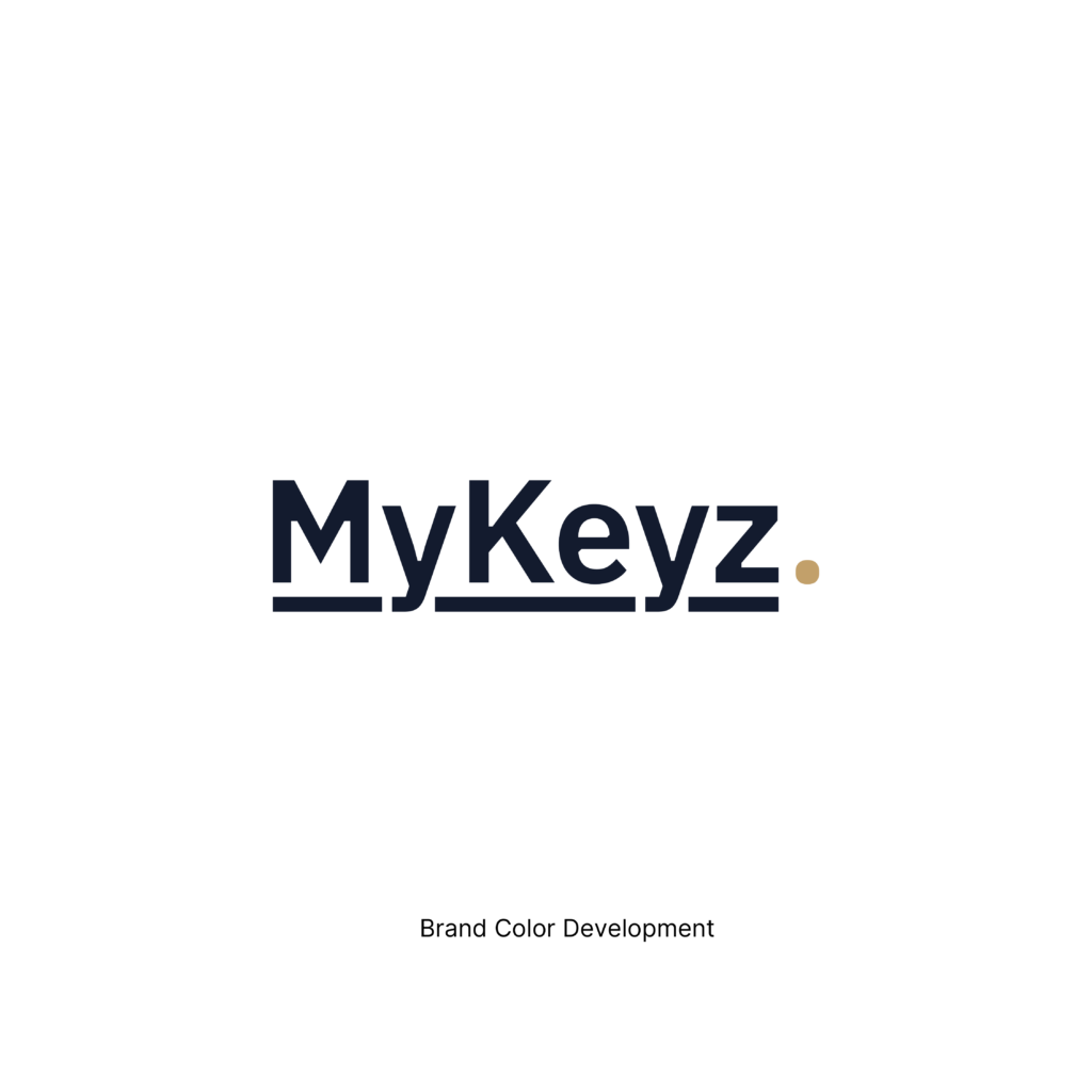
Eclipse Blue
White
Quiet Gold