Concept
Carlos just wants a hassle-free, clean move-in and a clean move-out experience period.
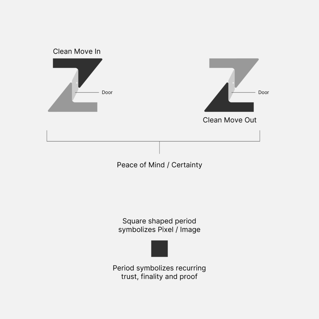
MyKeyz not only knows the ‘A’ (ins) but, most importantly, the ‘Z'(outs) to this and delivers Carlos the peace of mind he needs to sleep with every night while he is in Dubai.
Hence, the ‘z’ at the end is branded to make Carlos realise that, because having certainty over the end is what matters the most, and MyKeyz promises to deliver that.
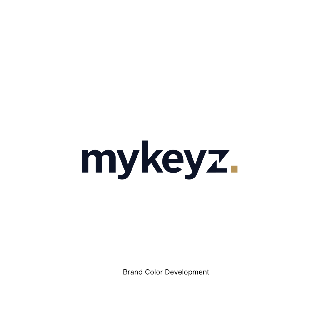
Public Sans has been used to develop the logotype, which is an ideal fit for MyKeyz because it’s simple, clear, and trustworthy—the same qualities Carlos looks for when deciding whether to trust a product. Carlos doesn’t want to learn a complicated system or navigate legal jargon; he simply wants something that works.
Combined with Midnight Ink and Document Gold, the typography creates the feeling of an official record rather than a technology product. Midnight Ink provides the confidence and authority of a trusted document, while Document Gold reinforces moments of verification and completion. Together, they help Carlos feel that his inspection has been properly recorded, verified, and taken seriously. The result is a visual identity that feels calm, reliable, and reassuring—turning uncertainty into confidence and helping Carlos feel that, for once, he’s on the strong side.
The period at the end also happens to stand out naturally within the Public Sans typeface and instantly felt like it was always meant to be for mykeyz.


Midnight Ink
White
Document Gold